Thursday, 24 April 2014

EXP 2 Week1: Axonometric Drawings and Lumion

Axonometric Drawings and Concepts:


Mies van der Rohe:


1. Creation of tranquillity and escape by means of an inhabitable sculpture


2. Limitation of excess to emphasise open space

3. Complementing the local environment by the juxtaposition of form, materiality and proportions with the surrounding landscape

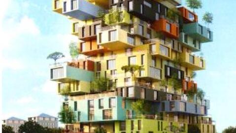
Nathalie de Vries:


1. Reflection of the environment in structural forms to integrate the landscape with the urban fabric

2. Championing vertical living by adhering to the demands of population increases

3. Creating a shared circulation to integrate the community


Sketchup to Lumion Axonometric 1:

This is the first axonometric form in Lumion imported from Sketchup


Tuesday, 22 April 2014

EXP 2 Week 1: Concepts

Concepts:

Mies van der Rohe:

1. Creation of tranquillity and escape by means of an inhabitable sculpture
2. Limitation of excess to emphasise open space
3. Complementing the local environment by the juxtaposition of its form, materiality and proportions with the surrounding landscape
4. Infinite freedom of movement through punctuated linear space
5. Integration of surroundings through ambiguity of interior and exterior


Nathalie de Vries: (of MVRDV)
1. Reflection of the environment in standard forms to integrate the landscape with the urban fabric
2. Championing vertical living by adhering to the demands of population increases
3. Creating a shared  circulation to integrate the community
4. Making repetitive forms unique through changing materiality and scale
5. Encouraging social interaction through the enclosure of spaces


Wednesday, 2 April 2014

Week 4-- Final Submission Animations

Overall Sweeping Shot


Side Elevation Section Cuts:


Front Elevation Cuts:

Week 4 -- Stair Section Drawings and Final Model Images

Stair Sections


 Final Submission Model Images:

Overall Shot 

Rem Koolhaas Bordeaux House Inspired Shot

Highlight of Underground Building Architectural Construction


Underground Building Composition and Materiality


Tuesday, 1 April 2014

Week 3 -- Texture Application

Inspiration for Platform in Stair Design


Client Objects and Applied Textures:

Top Section with Steinway Object and Nimble Texture Extending the Contrast Present in the Building


Bottom Section with Revival Motorcycle and Scarred Texture Creating Cohesion between the Top and Bottom Sections


Middle Texture Called Rigid Furthers Contrast Portrayed Throughout the Design


Week 3 -- 36 Textures

36 Textures


Above:

Branched

Bulbous

Carve

Fragile

New

Nimble

Peaceful

Ripple

Slippery

Supple

Translucent

Transparent

In Between:

Disjoint

Distorted

Dull

Erosive

Grainy

Porous

Rigid

Rocky-road

Shiny

Slimy

Urban

Woven

Below:

Ancient

Composite

Conglomerate

Idyllic

Malleable

Metallic

Reflective

Ribbed

Ruthless

Scarred

Sharp

Speckled