The Two Concepts:
Mies van der Rohe:
Limitation of excess to emphasise open space
The phrase 'less is more' is often linked to Van der Rohe as a guiding principle of his works due to his modern, minimal use of form to create open plan structures, sometimes to the detriment of the user as in the Farnsworth house.
The phrase 'less is more' is often linked to Van der Rohe as a guiding principle of his works due to his modern, minimal use of form to create open plan structures, sometimes to the detriment of the user as in the Farnsworth house.
 |
| The Farnsworth House |
Nathalie De Vries:
Creating a shared circulation to integrate the community
Nathalie de Vries, in her work with MVRDV, has been involved in many projects where large scale residences are involved in housing communities. Hence it is conceptually key to her designs that there exists shared circulation so that the individual is not isolated in a mass residence as often occurs in urban settings.
 |
| Shared circulation in the centre of the building |
12 Sketch Axonometrics and Concepts:
Mies van der Rohe:
1. Creation of tranquillity and escape by means of an inhabitable sculpture
2. Limitation of excess to emphasise open space
3. Complementing the local environment by the juxtaposition of form, materiality and proportions with the surrounding landscape
Nathalie de Vries:
1. Reflection of the environment in structural forms to integrate the landscape with the urban fabric
2. Championing vertical living by adhering to the demands of population increases
3.Creating a shared circulation to integrate the community
Electroliquid Aggregation of Axonometrics:
 |
| Left to Right: 1. Mies 1 and Nathalie 1 2. Mies 2 and Nathalie 3 3.Mies 3 and Nathalie 2 |
Electroliquid Aggregation:
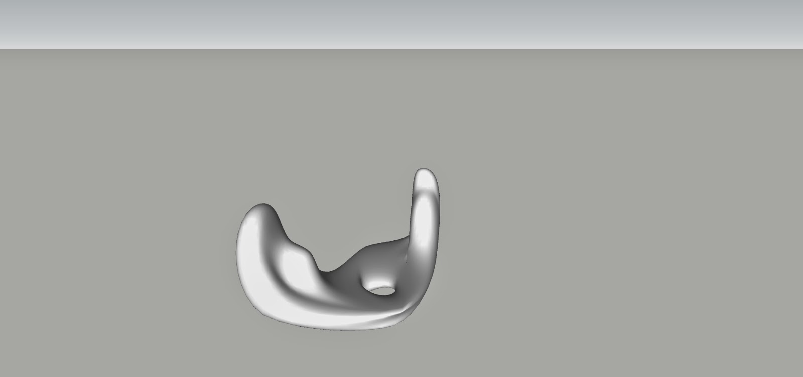
Van der Rohe's key premise, the limitation of unnecessary forms, emphasises open spaces and de Vries' need for a shared circulation integrates the community, as such, in combining these two concepts as an electroliquid aggregation we create a space that while open also creates specific circulations within the plan of the the structure, encouraging a communion of ideas through the individuals using it.
Using emphasised open spaces and the limitation of unnecessary forms create a shared circulation which, in turn, is a forum for social interaction.
Electroliquid Aggregation in Lumion:
 |
| Rift between the structures |
 |
| Dominant perspective of curvilinear structure |
 |
| Dominated perspective of rectilinear structure highlighting the open spaces between the structures |
36 Custom Textures: Light to Dark
 |
| 36 Textures Light to Dark |
Application of Textures to Model in Sketchup and Lumion:
Dark Texture:
 |
Used as a contrasting element to simultaneously highlight the vertical elements of the monument and the horizontal views through the monumentMedium Texture: |
Lumion Final Submission Image Captures:
 |
| This overall shot highlight the central circulation between the monuments and showcases the spires that hold this confluence above the valley |
.jpg) |
| Open space of the rectilinear monument akin to Mies van der Rohe's 'less is more' concept and highlights the circulatory path as used by the students in the monument to the forum space. |
 |
| Communal, central circulation of the curvilinear monument, created by limiting unnecessary form, promotes communion of ideas |
 |
| Illustrates the various circulatory paths between the two main monuments to their central forum area and the spire support structure of the stair set. |
 |
| Illumination of the key circulation within the monument that guides the social interactions between individuals from both the schools of Architecture and Engineering, in particular the central forum. |
Sketchup Model 3d Warehouse:
Arch1101_EXP2_Deetlefs_FinalModel
Dropbox Lumion Files:
https://www.dropbox.com/sh/qs3ha8mb459xya7/FgnTknHyAb


